20
2022Archer: A Workhorse Slab-Serif

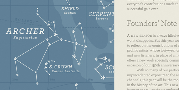
Archer is a typeface designed by the type foundry Hoefler & Frere-Jones. Because it has eight weights and 40 styles, it is an amazingly versatile typeface to work with. It is a slab serif and has loads of charm without being too cutesy. It was originally created by H&FJ for Martha Stewart Living magazine, who needed a personable, straightforward and credible typestyle. Archer needed to address certian typographic demands, since Living is an almanac of lists, recipes, charts, diagrams, tables, calendars, and glossaries. To make the typeface frank — direct, but not brusque — they introduced subtle cues from the world of typewriter faces, which combine the ordinariness of Antiques with the modern practicality of Geometrics. They restored the vanished ‘ball terminals’ to the lowercase, and uncharacteristically applied these gestures to the capitals as well, in order to yield a font that’s friendly without being silly, and attractive without being flashy. The result is a typeface that’s well-mannered, easy to work with, inviting to read and fun to work with. Go here to see all the styles.